This group of commands is used to show and hide various parts of Trend or Data Block Plots. These commands are also available from the right click menu on either a Trend or Data Block Plot.
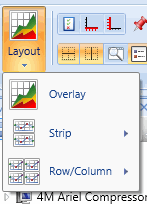
The Layout drop down contains three methods for viewing your data; Overlay, Strip, and Row/Column.
Overlay: Overlays all of the monitored measurements on one chart
Strip: Creates a strip chart based on the number of charts selected from the list.
Row/Column: Create a view of multiple charts based on number of rows and columns selected.

Display the Plot Selection window in the chart

Display the X-axis options window in the chart

Display the Y-axis options window in the chart

Display the events on the chart

Display the warning level thresholds on the chart. Use the slider bar to adjust the size of the warning level lines.

Click the counter arrows up/down to adjust the line thickness of the chart

Display horizontal grid lines on the chart

Display vertical grid lines on the chart

Display the overview for panning and zooming. Slide the bar to adjust zoom percentage.

Display the legend in the chart.

If checked, the Line cursor is displayed as a vertical red line on each Trace.

If checked, the Band cursor is displayed as two vertical red lines (or edges) on each Trace.

If checked, the Peak cursor is displayed as two vertical red lines (or edges) on each Trace, and the peak sample (maximum value of the displayed data) within the cursor band is displayed as a red dot.